Hey guys, sorry for the hiadas, but final came up and I had like 20 projects due so that was my excuse. But I am back! So for the first post of my return is a video I did for class on informational sharing. I know everyone wants to keep their secrets to themselves but sharing can benefit all! So no more talk, check out the video below.
P.S. This was my first animation and my first time working with after effects, so it a bit choppy.
Friday, December 18, 2009
Thursday, November 12, 2009
Monday, November 9, 2009
Thursday, October 29, 2009
11 Smart Logos.
One of my favorite area of graphic design are logos. It is often the first impression you give to the client of your company. A good logo needs to be memorable and unique. It needs to be smart and simple yet sophisticated at the same time. I've seen many logos in my researched since a year a ago. These are some of my favorite, you maybe not see classic logos like coca-cola and others here because I am focusing on smart logo that uses the type form to tell you about the company.
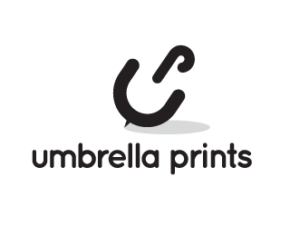
This one uses the U and the P to form the umbrella. I don't know about you guys, but I remember this logo just by glancing at it.

So obvious, yet would you have come up with it? Just one element added. The beak of the bird. Simple amazing. Some of these logos just make you say why didn't I come up with that?

The N is replaced by the number 2. Smart!

Not much to explain here, I think I would have come to the same conclusion I think. So simple that it couldn't be any other way.

This one is smart. Again, same as the logo above, playing with the idea of a helium balloon. So simple. But did you see the merge between the U and M? I think there's an element there that I might have never consider.

One of my all time favorite. It's a food critics guild's logo. Where it's the ink well pen tip where the middle is a spoon. Every time I look at this logo I get blown away by its simplicity and effectiveness.

This one probably over post, but oh well. I think it's just too smart and probably accidental. I wonder how much of logo designing is luck and how much is skills?

This is a smart concept. Where they form the who logo with the form on the number 8. I would have never think twice about this idea. This is simply skills.

A smart simple design. The C and S in creative sweet are represented by their lowest recognizable form.

This one is just beautiful. Very memorable.

This one uses the U and the P to form the umbrella. I don't know about you guys, but I remember this logo just by glancing at it.

So obvious, yet would you have come up with it? Just one element added. The beak of the bird. Simple amazing. Some of these logos just make you say why didn't I come up with that?

The N is replaced by the number 2. Smart!

Not much to explain here, I think I would have come to the same conclusion I think. So simple that it couldn't be any other way.

This one is smart. Again, same as the logo above, playing with the idea of a helium balloon. So simple. But did you see the merge between the U and M? I think there's an element there that I might have never consider.

One of my all time favorite. It's a food critics guild's logo. Where it's the ink well pen tip where the middle is a spoon. Every time I look at this logo I get blown away by its simplicity and effectiveness.

This one probably over post, but oh well. I think it's just too smart and probably accidental. I wonder how much of logo designing is luck and how much is skills?

This is a smart concept. Where they form the who logo with the form on the number 8. I would have never think twice about this idea. This is simply skills.

A smart simple design. The C and S in creative sweet are represented by their lowest recognizable form.

This one is just beautiful. Very memorable.
Wednesday, October 28, 2009
My recent work: Literacy is Power + Human

The power of literacy if often overlooked in third world countries. Often these people have too much to focus on to worry about literacy. They are often too hungry and poor to even worry about books and education. My literacy projects aim inform these people about literacy and its power. This is a sketch of designs I plan of executing. Please let me know what you think. I am alway open for discussion.

This piece is my commentary on the grid chapter in the Higgin book about the grid system. Since everything in our lives revolve around the grid and the cubes, my comment was that... even though our thinking is based on logic and order, the moment emotions are introduced, it overrides all logic.
Tuesday, October 27, 2009
So frustrated today.
I just feel so frustrated today. I just feel so unorganized, and I hate that feeling. I love to know exactly what I have to do ALL THE TIME! Everything is just not going right this week. It all started with my little fender bender last week. Then everything just went down hill. Hope fully..
this little rant/blog will put in all in perspective for me. So lets start and see what is exactly bothering me...
1) I feel so disorganized as of right.
2) I feelso am broke!
3) I haven't been satisfied with my work lately.
Solving problem #1:
What I have to do for classes.
All Classes: Process Book
Production 356: 1. Machine and presentation
Design 351: 1. Research, 2. Wall Design, 3. Edit Facebook Map,4. Higgin Project, 5. Choice
Design 400: 1. Book, 2. Bitmap Typography, 3. Postcard, 4. Edit Resume, 5. Kerning
Order of importance
0. Process Book
1. Machine and presentation for Can's Class tomorrow.
2. Research and visual for library project
3. Postcard printing
4. Kerning
5. Book
6. Edit Resume
7. Bitmap Font
8. Edit facebook map
9. Higgin Project
10. Choice Project
What I have to do for my life.
Clean my laptop.
Clean my room.
Do laundry.
Focus.
Solving #2:
Get a job ASAP.
Sovling #3:
Make better work!
this little rant/blog will put in all in perspective for me. So lets start and see what is exactly bothering me...
1) I feel so disorganized as of right.
2) I feel
3) I haven't been satisfied with my work lately.
Solving problem #1:
What I have to do for classes.
All Classes: Process Book
Production 356: 1. Machine and presentation
Design 351: 1. Research, 2. Wall Design, 3. Edit Facebook Map,
Design 400: 1. Book, 2. Bitmap Typography, 3. Postcard, 4. Edit Resume, 5. Kerning
Order of importance
0. Process Book
1. Machine and presentation for Can's Class tomorrow.
2. Research and visual for library project
3. Postcard printing
4. Kerning
5. Book
6. Edit Resume
7. Bitmap Font
8. Edit facebook map
Clean my laptop.
Clean my room.
Do laundry.
Focus.
Solving #2:
Get a job ASAP.
Sovling #3:
Make better work!
Monday, October 26, 2009
Saturday, October 24, 2009
Tuesday, October 20, 2009
Friday, October 16, 2009
Hola Festival!
Thursday, October 15, 2009
I'm in Memphis!


A photo-shoot at Shelby Farm with my friend Carly. So there you have it, when you feel stale, new location helps...
So as for finding my creativity again, I decided to travel down here to visit my brother and some of my friends. I think the new environment and people is very refreshing and will affect my work. We'll see though... I'll keep you posted.

We were driving around to find some building to shoot at, I was hesitating to go in at first. Carly a cool camper she was, told me "lets just walk around and you'll find something interesting to shoot." She was right, there was a perfect shooting location on the roof of the garage.


more photos from this shoot can be found on my flickr.
Monday, October 12, 2009
Losing inspiration.
When I woke up today, I've lost all motivation and all inspiration. I don't how it had happened but it has. Every designer's fear. Someday we just wake up and it's all gone. A scary thought in indeed, but what can we do to bounce back? Today I will be set out to do just this. Answer a few questions for myself, and hopefully ask a few more.
I have three...
projects I have to finish by tomorrow, yet none of them are done. On top of that, a new assignment have been given out today in Can's (Jon) class. That's 5 projects I haven't done yet, and nothing to motivate me to do so.
Places I looked today...
Things to do when you're feeling stale
Thursday, October 8, 2009
3eb concert

I recently went to the Third Eye Blind concert in Knoxville. I have to say, they put up a great show. I love their old stuff, always remind of the 90's if you can remember all the way back then.


Here are some photos I took at the concert. I will post more later, I am actually in the process of making my first stop motion video using photography so keep an eye out for that. These three photos I took with slow shutter speed around 65 and f/5.6. I set the ISO pretty high since it was dark in there. I think the results came out pretty nice. Let me know what you think.
Friday, September 25, 2009
Vanity Fair: Potraits.
My brother sent me an awesome book of photography. Just thought I share a little bit of it with you.
Tuesday, September 15, 2009
Thursday, July 2, 2009
Tuesday, June 9, 2009
Hasselblad H3D Digital SLR: Luxury Cameras
So have you ever asked yourself... if money wasn't an issue, what would be the best camera to get? I have, and yes this would be the camera I would get. A Hasselblad. Enough reading, lets watch some video about these luxury camera series.
Drools.
Drools.
Tuesday, June 2, 2009
Mario Testino, A Glimpse Into How He Shoot
So from time to time I like to look at how professional run their shoot and how they set up. In this article we will explore how Mario Testino, one of the elite, set up and shoot his model. Mario shoot for big names such as Vogue and Vanity Fair with countless celebrities.
Some of his work.
On shoot with Cameron Diaz.
I really like his work because at time it is quite simple, yet elegant. His resume is well, astounding. I'm sure there are a few things we can all learn from him. I hope this glimpse will inspire you and teach you a few things that will let you take better photos.
Monday, June 1, 2009
Canon EOS-1Ds Mark III

So it's time once again to look and drool over a camera most of us will never afford. But I so want it so bad... the camera? The Canon EOS-1Ds Mark III is top of the line pro's camera.
What's the goods behind this bad boy? Well it shoots at 21.9 megapixel with "very low noise, high quality images; live view shooting; pro-level build-quality and performance." -CNET
Here is the review
Friday, May 29, 2009
How to Take Better Photos: 3 Easy Steps
In order to take a "good" picture, you must keep three things in mind. It is much simpler to take a good photo than you would think.
1) the SUBJECT...
The first thing you need keep in mind is the "subject". You need to define what is the subject of the picture. Decide whether it is a person, animal, building, place etc. that you are taking picture of. With the subject in mind, you are nowmore keen to the placement of the subject in the photo. This will lead to better composition and good perspective.
2) LIGHTING <<<
The second thing to keep in mind is lighting. You don't want it to be too bright or the picture will be overexposed. You don't want it too dark either because the picture will be too dark. If you find that your picture is being over expose, then you can either lower the film sensitivity (ISO) or the shuttle speed or both. If the picture is too dark, then you can crank up the film sensitivity (ISO) or increase the shuttle speed. Another good easy tip is to adjust the white balance (WB) on your camera for appropriate lighting. Set it to tungsten, fluorescent, daylight etc. Keeping these simple ideas about lighting in mind will give you much be quality pictures, no matter what camera you use!
3) FOCUS FOCUS FOCUS!
Thirdly and probably the most important is focus. If a picture is not in focus, then nothing else really matters. You probably noticed already, but if you compare a pro's photo with an amateur you can really see the difference. Most of the time, the pictures taken by amateurs are grotesquely out of focus or blurry. To ensure good focus, make sure the laser light beeps on the subject before you snap away. Another way to get sharp picture when you've tried everything already is to turn on your flash. This tend to give me the result I want when I can find no solution, but it is at the cost of sometime harsh lighting.
the "Holy Trinity of Canon Lens": the 35mm, 85mm f/1.2, 135mm f/2

So when I got my first serious camera, a Canon Rebel XT, I didn't know which lens to invest in. I mean who could blame me, do you know how many lenses are out there for the Canon SLR series? Anyways, I did my research and stumble upon a small inexpensive lens people call the 'fantastic plastic'. This was the 50mm EF f/1.8 of course. So since then for 2 years, I've been shooting with this lens trying to master it.
I gotta say, I've hit the learning curve on it pretty hard. And now that I have some extra cash laying around, I thought I invest into a new lens, something a little pricier that has a little more range.
Of course, before diving into something that cost more than 5 bucks, I feel you should always do a little research. I talked to my brother, who is a huge photography enthusiast like me, and he recommend 3 lenses which he and other people have deemed the "Holy Trinity of Canon Lens". i.e. 35mm, 85mm f/1.2, 135mm f/2
The 35mm f/1.4-2/0

Now for this lens depending on which f-stop you want, the price can range greatly. For the f/1.4, amazon range it from $950-$1500 and for f/2.0, amazon range it from $230-$300. So is f/1.4 and f/2.0 difference really worth $1200? One thing for sure, the f/1.4 has a red ring and the first thing you should learn from lens is when it has a red ring, it's a damn serious lens. You don't see many amateur walking around with those kind of lens usually. As for what this lens can do... you can check out some sample here. Honestly, I think with the 50mm f/1.8, I pretty much can come up with the same shots.
The 85mm f/1.2

This lens cost about 350-400. It's dept-of-field seem much better than of the 50 mm for sure. Although close to the 50 mm I think the quality of its shot is much crisper. I am considering upgrading to this one, it's not too steep of a investment and can provide me something better to use for the wedding I got line up in July. Some sample shots can be found here.
The 135mm f/2

This lens ranges from $1000 - $1200. Also one of the lens I am considering to upgrade to as well. Although at $1000 it is a little steep. But what specs does it have? Check some sample here.
Thursday, May 28, 2009
The Business Side of Photography: Princing
So as we all may know once you get good and decide to work for some cash, you might need to know how to charge your client. Depending on your skills of course will results in the prices you can charge.
Usually, for a quick session, 1/2 - 1 hour shoot, I charge around 50-100 for the session. Then for editing
I charge around 20 bucks an hour. Now keep in mind that this is not just for the labor, it is also charge for the equipment as well. You charge for the laptop, camera, lenses, and the programs you will use to process the photos. Just like a taxi cab driver does not just charge you for his time, but he also charges for gas and the depreciation on his car. A photographer must do the same.
Don't ever let your client haggle with you, the price is set. If they can't afford it then it's okay to tell them no. Let them find other photographers who will do for dirt cheap price. People will learn that nothing in life is free and you will get what you paid for.
Here's a video I came across of David Airey's blog about this...
This article may not help you take better photos, but it surely will help you be smarter about hiring out your time and effort. There's no worse feeling when you're on the job and feel like you're grossly under paid. This can effect the level of photography you produce.
Tuesday, May 19, 2009
Annie Leibovitz, A Glimpse Into How She Shoot


One my favorite photographer of all time, Annie Leibovitz has a unique style that makes he photographs timeless and at time like paintings. I love her style and we can all learn a thing or two from her. Watching this videos will directly and in directly give you Better Photos.

stills from the previous video
These are the capture images after processing... they are simply amazing. Her attention to light is mind blowing. Of course her processing is of pro quality, but her composition is what makes the photo in my humble opinion. Looking at all these pros makes me want to change to film... it is too bad I cannot afford to do so yet.


Annie answer 10 questions for TIME.com
If you would like to watch more video about Annie Leibovitz click here. Was this article helpful? Please do leave comments and feedback.
Sunday, May 17, 2009
Nikon D3

Okay. It's time to look at the new Nikon D3. If you're not drooling yet, you will soon.
ISO: 200-6400
Weight: 2.7 lbs
Resolution: 12 megapixel
Continuous shooting speed: 9 frames per second
Price range: $4,349.00 - $4,999.95
My only complaint is... if I am dishing out 5 grand for a camera I want more mega pixels please. It's not like I will be able to afford one of these baby anytime soon anyways.
What is ISO?
So if you're new to the digital world and you have a nice camera, you might have a setting labeled ISO. You may not know what this is or what it does but you soon will. What ISO is the equivalent to film sensitivity with film cameras. Basically it set how sensitive you're image sensor is to light. The higher the ISO, the more sensitive the image sensor is and thus you can take picture with lower light. Keep in mind though, the higher the ISO setting is, the more noise you will get in your photos. It is a trade off of course.
So ISO setting... range from 100, 200, 400, 800 and 1600.
Unless you have a nice camera, 1600 ISO is out of the question because the (image) noise will become too much of a factor. I tend to shoot with ISO 800 at night and 200-400 during the day time. The number represent how many pixels you are willing to sacrifice to noise. So at ISO 1600, that is a lot of pixels!
My advice to you guys is this, keep the ISO as low as you can while changing the shutter speed and f-stop. Who likes noise in their picture right? So keep ISO in mind and you'll have less noise and less noise makes Better Photos!
If you like further details about this subject I recommend these articles...What is... ISO? | What is ISO setting on your digital SLR (DSLR) camera and how do you use it?
Saturday, May 16, 2009
What are the Visual Elements in a Photograph?
So if you're new to photography, which I sometime feel like I am still after two years, this should be the first article you read on my blog. When we look at a photograph, we can most of the time decide if we like it or not. Most of us however, rarely give a second thought to why we like or dislike something.
It's like when we dine, we can say immediately if we like certain dish or not. Yet we may not know how to create that dish or even what goes in it. So it helps to learn the basic visual elements that makes a photograph and understanding the visual elements will make your photos better.
So what are the visual elements of a photograph? They are focus, light, value, lines, shape, space, texture and repetition.
Good. That's awesome, but what are they exactly?
focus: is the area that is clearest/sharpest in the photograph. If a photograph is blurry, it is said to be out of focus.
light: is how the subject is lit. It usually concern the direction of light, high or low contrast, direct or reflected, natural or artificial and hard or soft.
value: is related to light. It is the range between the darkest dark and lightest light.
lines: Some time certain objects can create lines in a photograph. These lines can lead the eyes in the photograph and can make the piece more or less interesting. The line can be thin or thick, straight or curve and real elements or implied.
shape: no matter what we look at, our mind is trained to see shapes. So when we look at a photograph, we instinctively find familiar shapes.
space: is the area the photograph convey. Is the space shallow, or is it deep. Are there more negative or positive space?
texture: texture can add another dimension to your photograph. Whether if it's fur or rust, make your viewer imagine what the texture feels like.
repetition: sometime objects repeat and create patterns, this can also make your photograph more interesting.
So now you have an idea of what a photograph is made of, just keep these things in mind and you'll definitely take better photos! Just don't get too bogged down with the elements and have some fun as well. There's no better way to learn than doing!
About this site.
Here I am are all about improving the photos you take. Each photo you take should improve from the last. Each session you do should be better than the last. Even great photographer still have things they can still learn. So I dedicate this blog to learning and taking better photos.
Community is a crucial part of learning. One can learn by oneself but the improvement is slow. In the community environment trades secret can be trade and we can all improve each other. So lets build a community where we can all feed off on!
Community is a crucial part of learning. One can learn by oneself but the improvement is slow. In the community environment trades secret can be trade and we can all improve each other. So lets build a community where we can all feed off on!
Subscribe to:
Comments (Atom)


